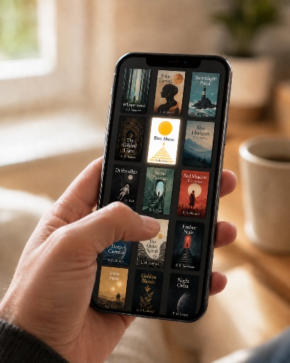
We’re all taught not to judge a book by its cover. Then we walk into a bookstore, or scroll a screen, and do exactly that in about a second, usually without noticing we’ve done it. A reader’s first decision about your book is made at the cover, often presented at the size of a postage stamp on a phone, and that’s the reality your cover has to survive.
Chances are that you imagined and developed your book’s cover alongside writing your manuscript, as a visualization of what the book means to you. Maybe it came to you before you wrote a word, maybe it grew as the story did, maybe you designed it yourself once the draft was done. When and how it arrived doesn’t matter. It’s yours, drawn from the same creative instinct the writing came from. That instinct has a place in this—we’ll get there—but your vision is only one piece of a bigger job.
A Cover Is a Marketing Tool First
It’s tempting to think of a book cover as art, a chance to express your book’s soul, to capture a meaningful image, to do justice to everything inside. And while a great cover often is beautiful, beauty isn’t its job. Its job is to do one thing well: stop the right reader and tell them, almost instantly, “This book is for you.” Everything else—the artistry, the cleverness, the personal meaning—is either in service of that or working against it. What the cover means to you is raw material a good designer translates into something a reader can feel in a second.
Notice the word right before reader. A cover should not try to appeal to everyone but rather send clear signals to the specific people who will love this particular book. A literary novel, a cozy mystery, and a hard-science thriller make very different promises, and their covers should too. When a cover tries to be universally appealing, it usually ends up speaking to no one in particular.
Genre Is a Language Covers Speak
Every genre has visual conventions—typefaces, color palettes, layouts, imagery—that readers have learned to recognize without knowing they’ve learned them. A romance reader can spot a romance novel from across the room, and a thriller fan knows the look of the book they want before they read a word. Far from a lack of imagination, these conventions are a shorthand that tells a browsing reader, fast, what they’re holding.
Authors often want to break those conventions to stand out. It feels right. Why look like everyone else? The impulse behind that, wanting your book to feel like itself rather than a clone, is exactly right, and a good designer shares it. But when that instinct isn’t tempered by what the market rewards, the result isn’t “fresh and distinctive.” It’s “I can’t tell what this book is,” and a confused reader doesn’t buy. The trick is to honor the conventions of your genre and then be the sharpest, most arresting version within them. Stand out by being excellent at the right signals instead of abandoning them.
The Thumbnail Test
Here’s a simple, humbling exercise: shrink your cover to the size it will actually appear at in most online stores—a thumbnail barely bigger than your thumbnail.
- Can you still read the title?
- Does the image still hold together, or does it turn to mud?
- Does it still indicate what kind of book it is?
An enormous amount of cover real estate gets spent on detail no one will ever see at that scale. Covers that sell are the ones working well at thumbnail and print size.
Your Cover Isn’t For You
This is the hardest part, and we’ll say it plainly because that’s how we do things: the cover is not for you. It’s for your readers. The cover you pictured as you wrote, the one that means so much to you, may be exactly wrong for the person you’re trying to reach. Letting a designer who knows your market steer those decisions isn’t surrendering your vision. It’s giving your book the best possible chance to find the readers it was written for.
A great cover does quiet, essential work. It won’t make a weak book succeed, and it can’t stand in for the writing. But it’s the first promise your book makes, and you only get to make a first impression once, in about a second, at the size of a stamp.
But Your Vision Does Matter
None of this means stepping aside. What you imagined from the first page—the image, the mood, the meaning that made you want to write this book at all—is worth saying out loud, and a good designer genuinely wants to hear about it. Lay it all out, because the more clearly you can name what the book feels like from the inside, the more a designer has to work with. Then hold it loosely. The best covers come from your vision, a designer’s craft, and the reader’s eye all pulling on the same thing until it lands. Working with a professional cover designer does not mean handing your book over and discarding your vision. Book design should be a process of collaborating on one of the most important promises your cover gets to make while trusting the people who know this market to help you get the book in front of the right readers.